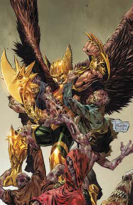
There is a lot of promise in this issue. The cover promises a zombie romp. The strange book investigated promises some sort of mysterious pulp history. The lead character, with his ridiculous costume, promise some sort of disconnect from reality and a wild tale involving shiny blades swinging and barbaric might. There’s a lot of promise floating around and only some of it is capitalized on.
The main complication of this book revolves around a book of ancient hieroglyphs which might be a connection to another realm of otherworldly monsters. Opposing sides race to determine the words contained within, and thus we can only imagine the power. It’s a decent set up that is mildly explored here. A convenient moment of connection opens up many of the secrets to Carter Hall yet no explanation is given.
Much of the dialogue in this issue is clunky or expositional. The book store owner uttering ‘Stay back!’ in the face of such bizarre danger is odd and also doesn’t mesh with the other dialogue on the page. There’s almost a Silver Age vibe permeating these pages, except the charm is lacking. The narrative drives forward and leaves the characters behind.
Given the nature of this tale, the protagonist would be more effective as a man with a fierce mind instead of a warrior with a fierce set of muscles and polished weapons. Hawkman is a ridiculous character, and that’s something that can be celebrated, but instead we get this ludicrous barbarian chasing down leads and pushing patsies around. This issue should have been more about Carter and the metallic man of might could be saved more a more revealing effect when the truly mighty battle begins. With the Hawkman prancing around these sequences, the gravity is lost and the tone becomes muddled. Otherwise, this could have been a more grounded and intriguing set up to something amazing next month.
Philip Tan’s art is loose and relaxed. However, the two opposing characters of good and possibly evil do not share this flimsy definition. It is as if the world is bland and wonky and only the characters of true power and importance are given any real direction and structure. The colors by Imaginary Friends Studios support this by giving Hawkman a gloss nothing else comes close to and offering the Gentleman a washed through hue that sets him below the standard funk of the rest. It’s an interesting way to draw attention and eyes to what is the most important, or powerful, in the comic.
“The Savage Hawkman” is a comic with some ideas but not the straight through line on which to hang and arrange them in order. The tone of the book is haphazard and it’s not quite ready to make Carter Hall a prime time player. The cover to this issue promised much and ultimately failed to deliver.

